
|
|||
|
 —by Scott Frazier
I am often accosted at conventions by people with portfolios and asked to look at them.
I'm always happy to do this. A lot of the time the art is by fans who have never
drawn much of anything before but they are so obsessed with anime that they want to draw in a similar
style. As often, the people want me to evaluate their portfolios and tell them what chance they would
have of getting a position in an animation company.
There is no title for the image but for those who don't know or don't remember the characters are from the first GALLFORCE OVA which was released in 1985. Original character designs were by Sonoda Kenichi. As far as I have able to determine this is not traced or copied from any existing illustrations in magazines or anything.
First, let me point out that because anime/manga style is so foreign to most Westerners it takes more than copying a bunch of images in books to be able to work in it. The best an artist can do is work with various styles and evolve his or her own style as soon as possible. One should also keep in mind that this style is nice to work in for pleasure and a hobby but should one wish to become a professional illustrator, comic artist or animator it is best to study a variety of styles, not just anime. Although it may sound strange, someone wanting to work in the Japanese industry should not show up with a portfolio of anime/manga style images. Companies will want an artist that can work in styles different from what they have extensive access to and a westerner who can draw in an anime style but has nothing else to offer is merely a curiosity.
The most common problem with fan art is that it is all too often copied from images in magazines, books, LD covers or manga. This is an important way of learning and polishing a style however a copy is not suitable to put in an art show or in a portfolio as it is not the original work of the artist. Work that is done as part of a team is likewise not material for an art show. In a portfolio, it shows that the person can work as a member of a team and can be valuable. Clearly label what part of the work you did.
One of the most important parts of art is the composition. Composition is the arrangement of artistic parts so as to form a unified whole, the juxtaposition of elements, i.e. the girl, the cat and the background.
The original GALLFORCE image here had a severe perspective problem. I sketched out the basic shapes of the characters and got this.
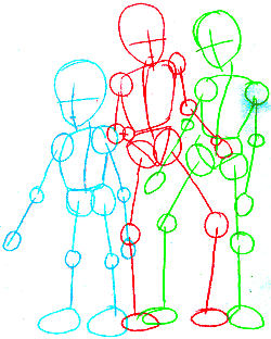 Not only are the bodies pretty deformed, they are all out of perspective to each other. In fact it's as if they are all standing side by side and somehow occupying the same space. There is no sense of where their feet are in relation to each other and where they are standing in 3D space. I used MetaCreations' Poser to place the characters in new positions in 3D. I also adjusted their poses to be a little less off-balance but they are still kind of strange.
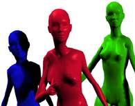
The 3D image appears as if shot through a telephoto lens, i.e. there is no depth of field. It's closer to the original but in comparison to the images below looks rather boring.
This is the same image as if shot with a standard lens. Perspective, especially when dealing with an image with more than one element is extremely important. This image is not only more interesting to look at but a lot more dynamic than the one with no depth of field.
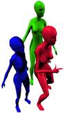
 Pull the camera back a ways and here are the characters' full bodies in 3D space.
Here are the same figures from various angles. See how Patty's (the green one's) pose really is weird? I left it this way throughout the project to show how one element can damage the whole.
|